Grok
Design analysis
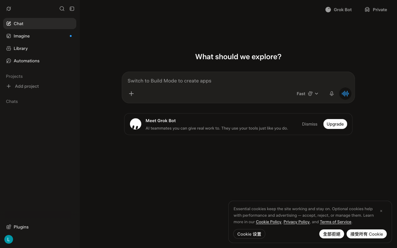
This shows the desktop version of Grok for the week of 2026-10-05, before scrolling. A menu on the left takes up about a fifth of the screen width. A large question at the top asks what to explore. The message box in the middle is the largest item on the screen. A card below the message box introduces Grok Bot. Most text is light enough against the dark background to meet a common accessibility guideline. There are no suggested prompts. There is no note that it can make mistakes. Compared with the week of 2026-09-28, the label on the Fast mode button is brighter.