Manus
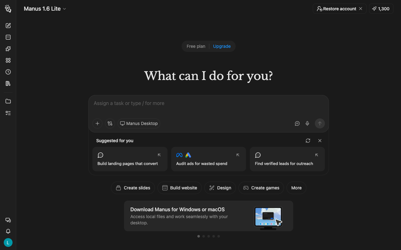
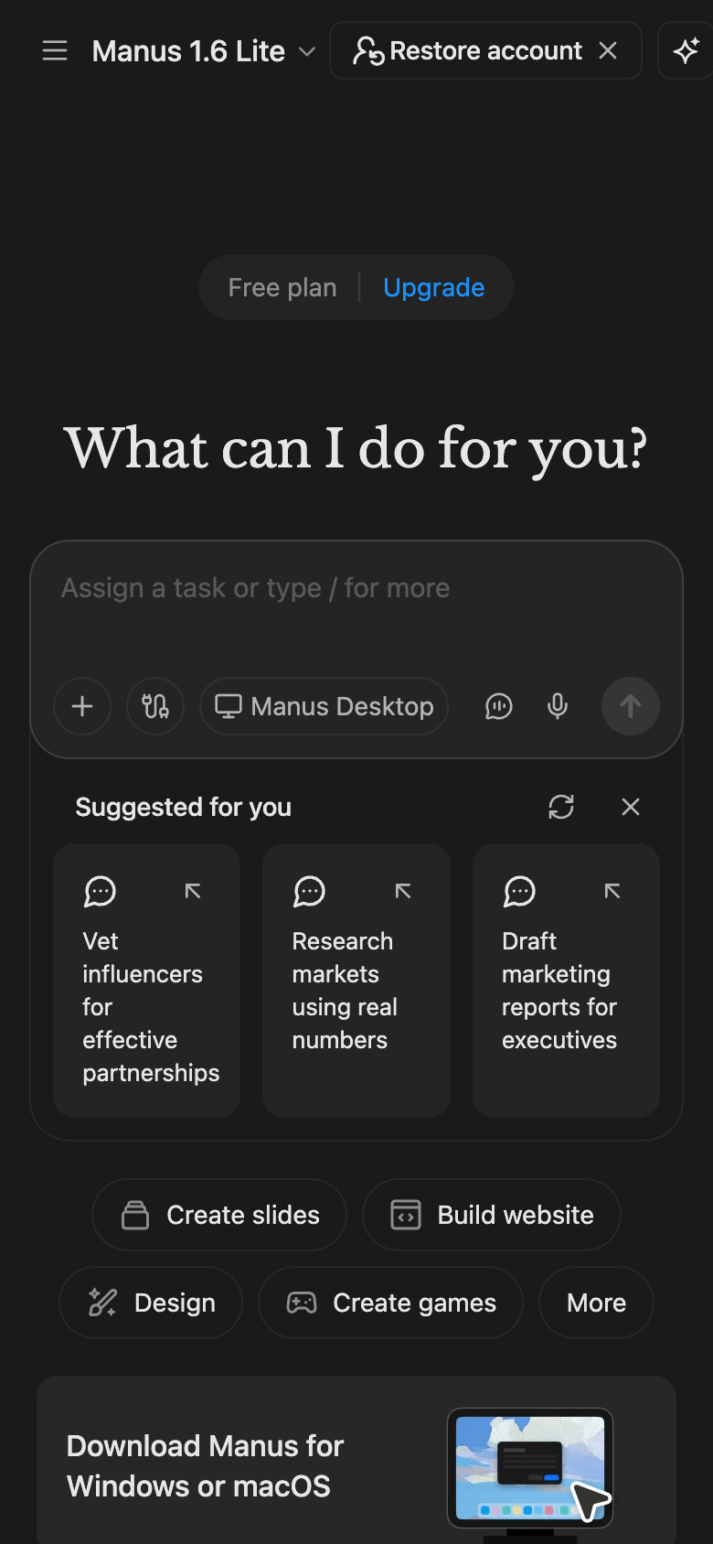
Design analysis
This shows the desktop version of Manus for the week of 2026-08-24, before scrolling. A narrow bar of icons runs down the left side, about 4 percent of the screen width. The large question at the top stands out most on the screen. The button labels are light text on a dark background that meets a common accessibility guideline. The outline of the message box is faint, but the label on a button inside it is easy to read. The hint text inside the message box is lighter than a common accessibility guideline recommends. Five buttons below the message box show what it can do, such as Create slides. There is no note that it can make mistakes.